

Sep 1, 2024
Moneythink CMU is a student-led organization that helps bridge the financial literacy gap by mentoring Pittsburgh high school students and equipping them with real-world money management skills.
As the Director of Design, I led a full rebrand to give the club a fresh, modern look that better reflected its goals. This included designing a new logo, refreshing the fonts, and creating a cohesive and standardized brand identity for stronger recognition and appeal. I developed eye-catching templates, posters, and social media content to boost event promotion and engagement. To bring the brand to life, I also mentored a team of student designers, ensuring a consistent and professional look across all digital and print materials, and helping them understand design principles like hierarchy and other Gestalt principles. The rebrand successfully increased the club’s visibility, making a lasting impression on members and the wider community.
Before:
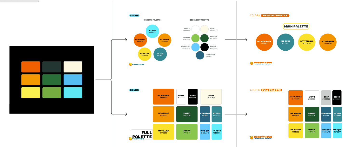
I was pulled onto the org as Moneythink CMU was going through a rebrand. Color Palette was much brighter, there were no more gradients, and the fonts became rounder and bolder. The previous president had started on ideas for it, but it was not fully fleshed out, and not consistently implemented. The rebrand was to emphasize the fun, approachable aspects of the club much more, with bubbly fonts, bright colors, and a "gamified" look. However, we were getting complaints that the rebrand was unprofessional and illegible.

After:
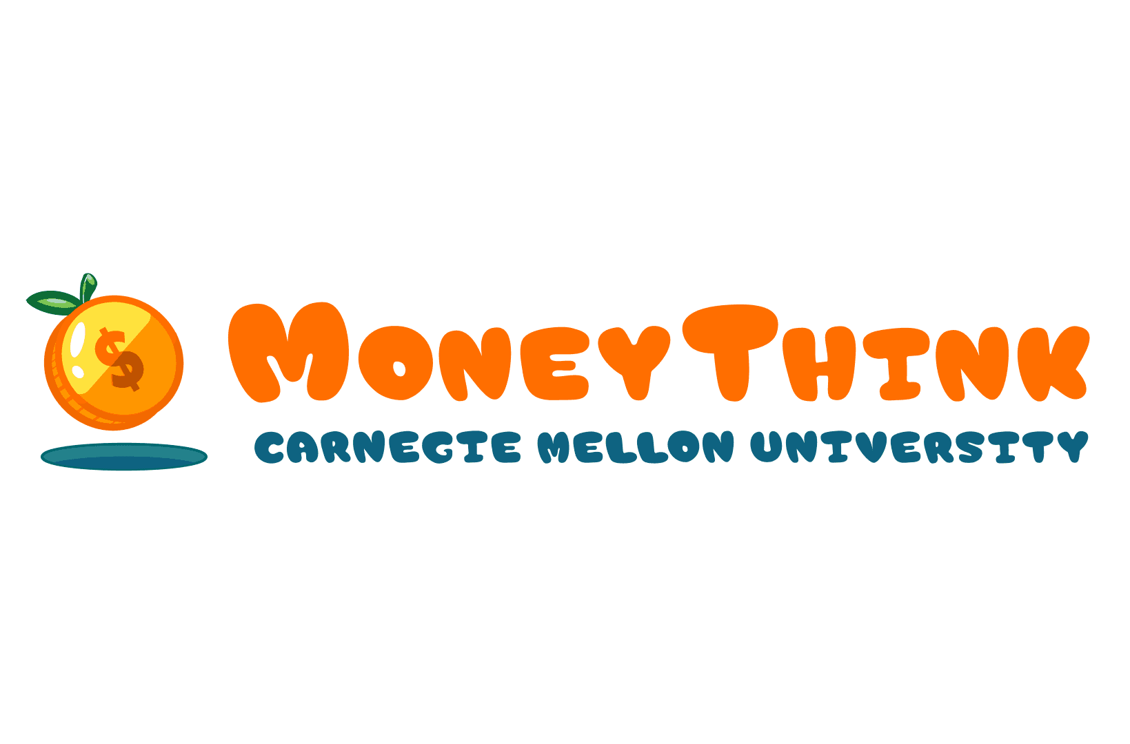
Logo Development:

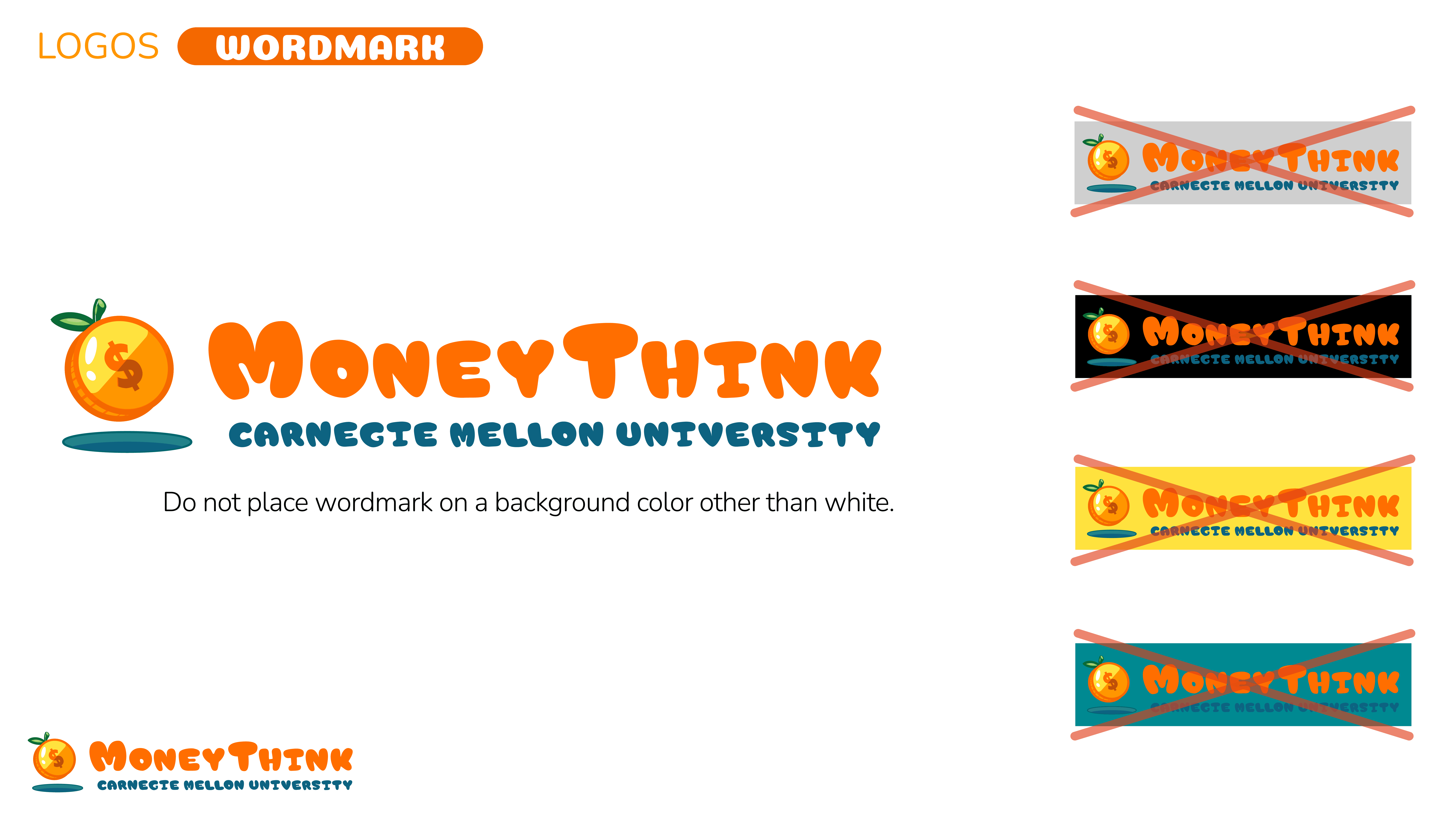
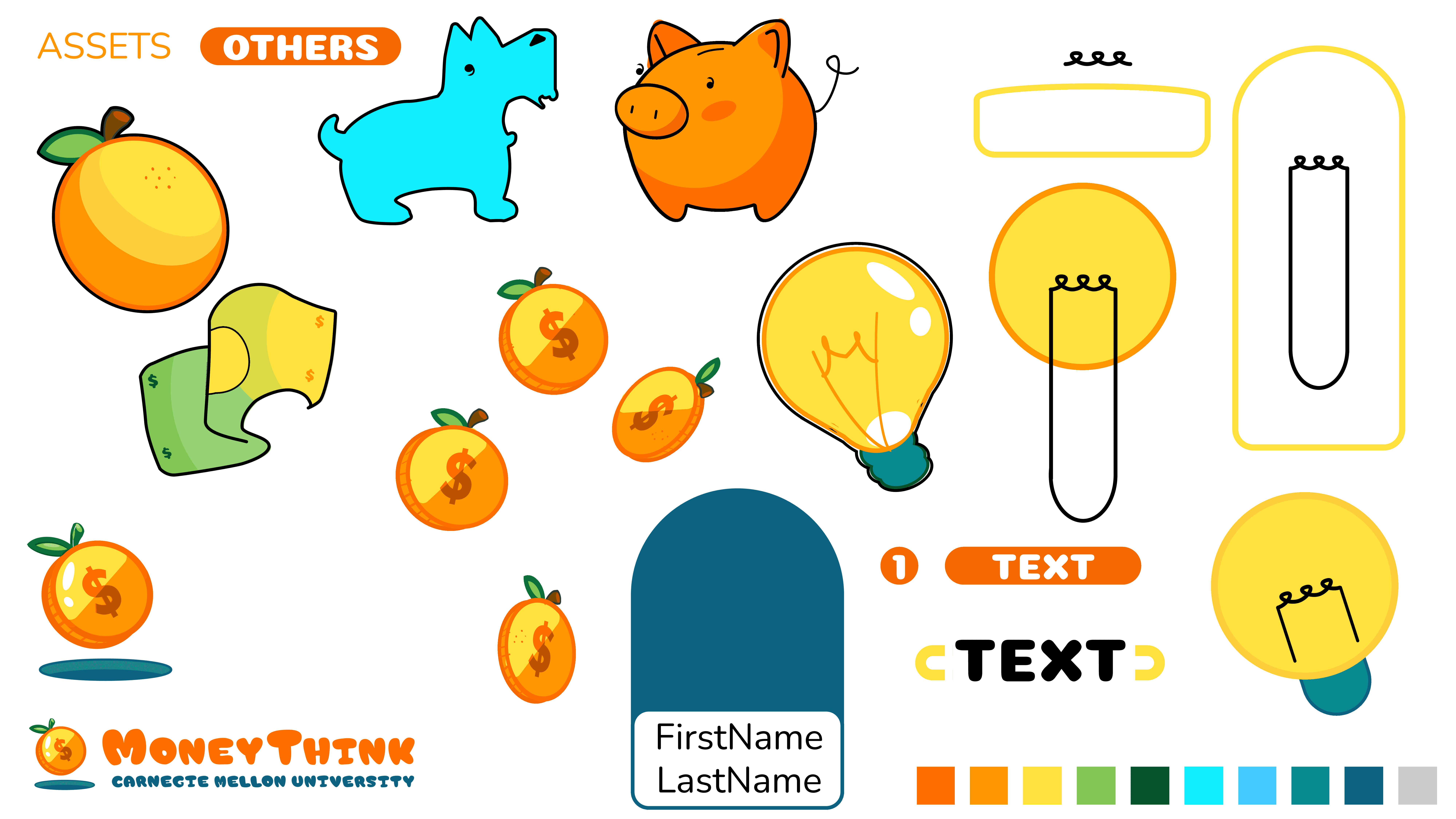
I was provided with an orange as the initial logo concept. I refined the assets into clean, vector-based graphics, utilizing solid color blocks and bold lines to improve clarity and adaptability. To create a more meaningful and easily recognizable logo—especially for those unfamiliar with the club—I combined the orange with a coin, seamlessly integrating both elements into a cohesive and visually impactful design.
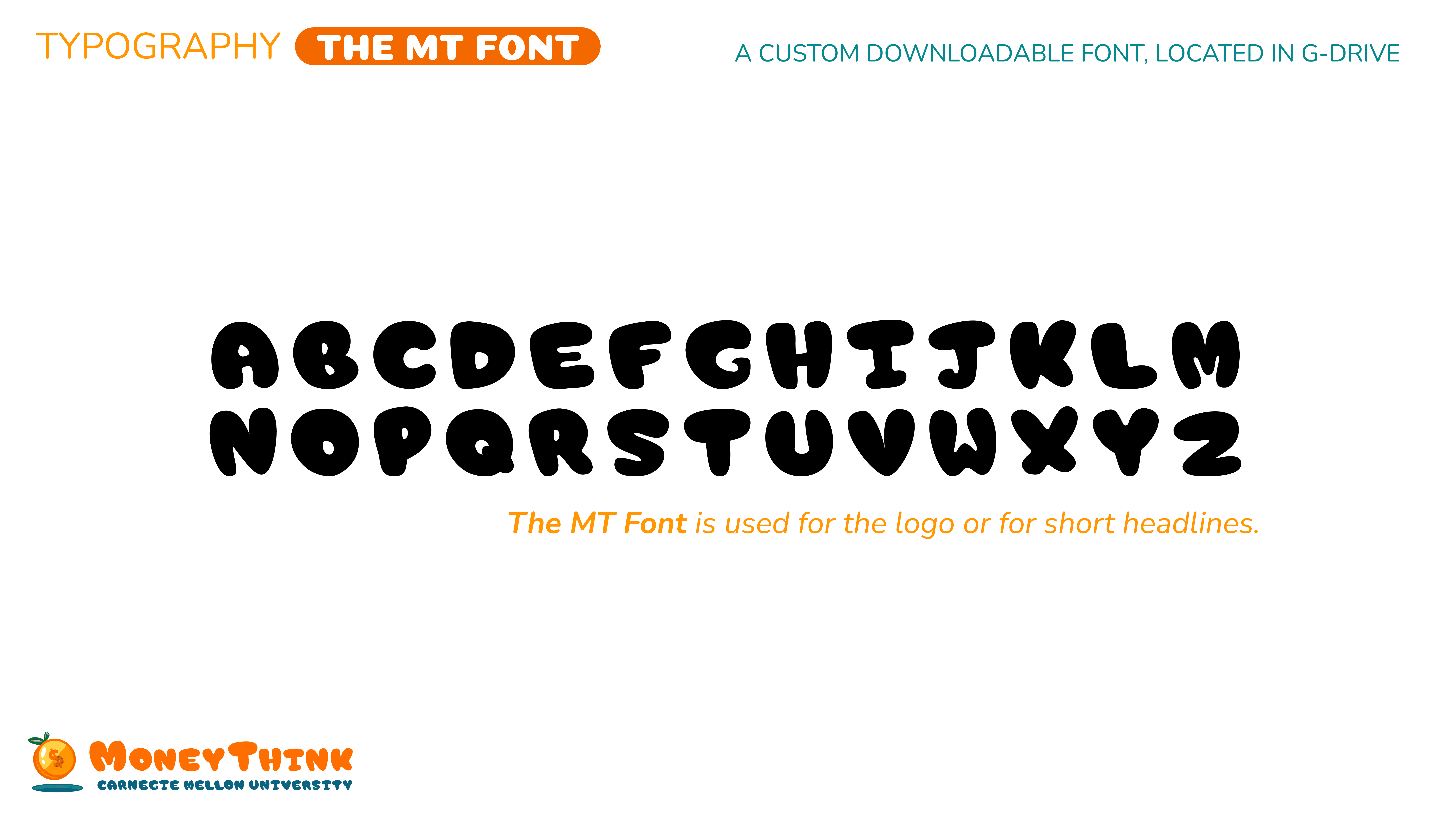
Tweaked the Custom Font to Improve Legibility:

Pale orange on the top is before, dark orange on the bottom is after I made changes to improve readability.
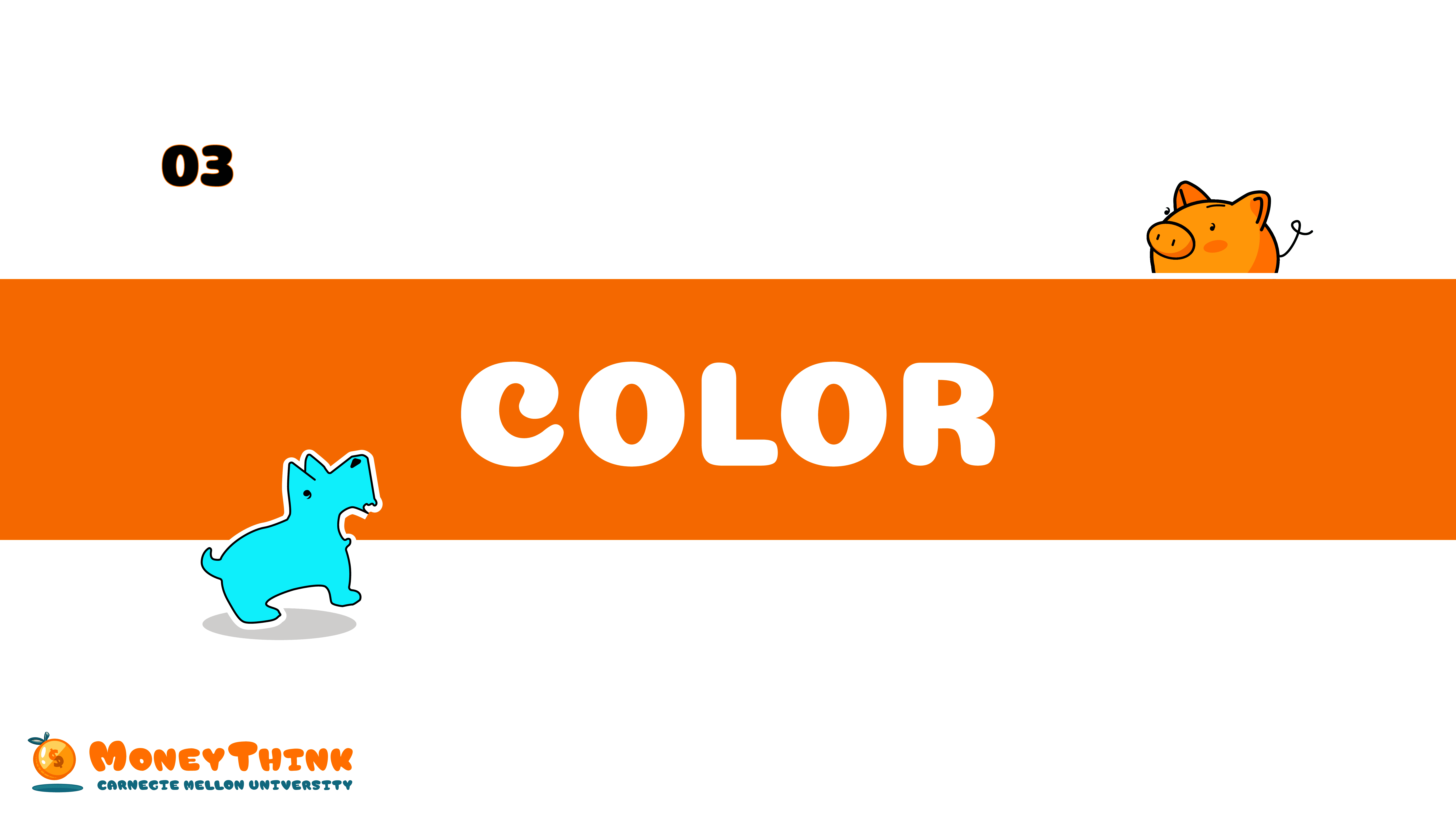
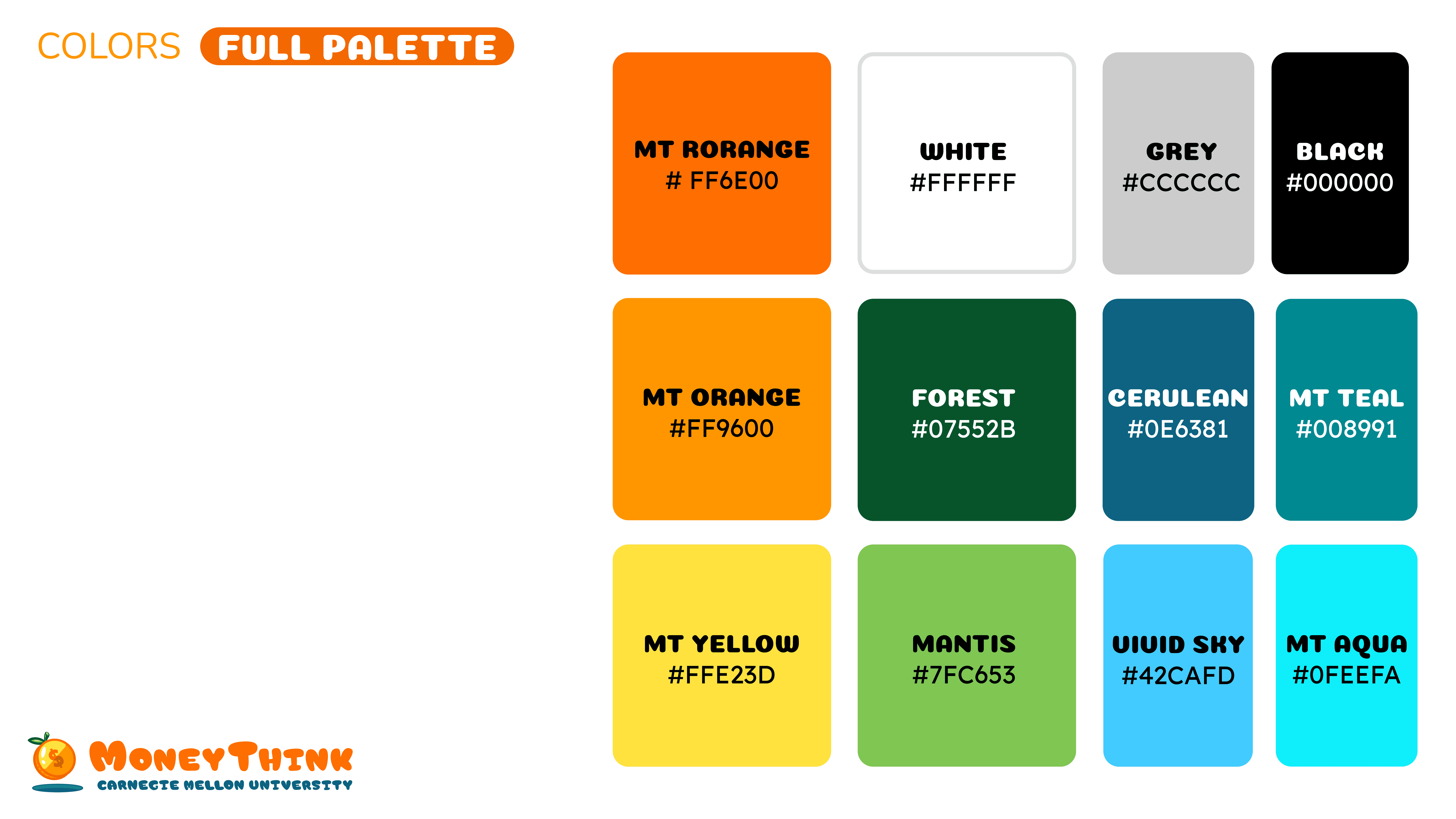
Refined Color Palette, keeping contrast in mind:
——————————————————————————————
Complete Branding Guide